


Select your Market
-
{{ userContent.title }}

{{ userContent.lookingForMoreLabel }}


Pharmaceutical Packaging, 1970s
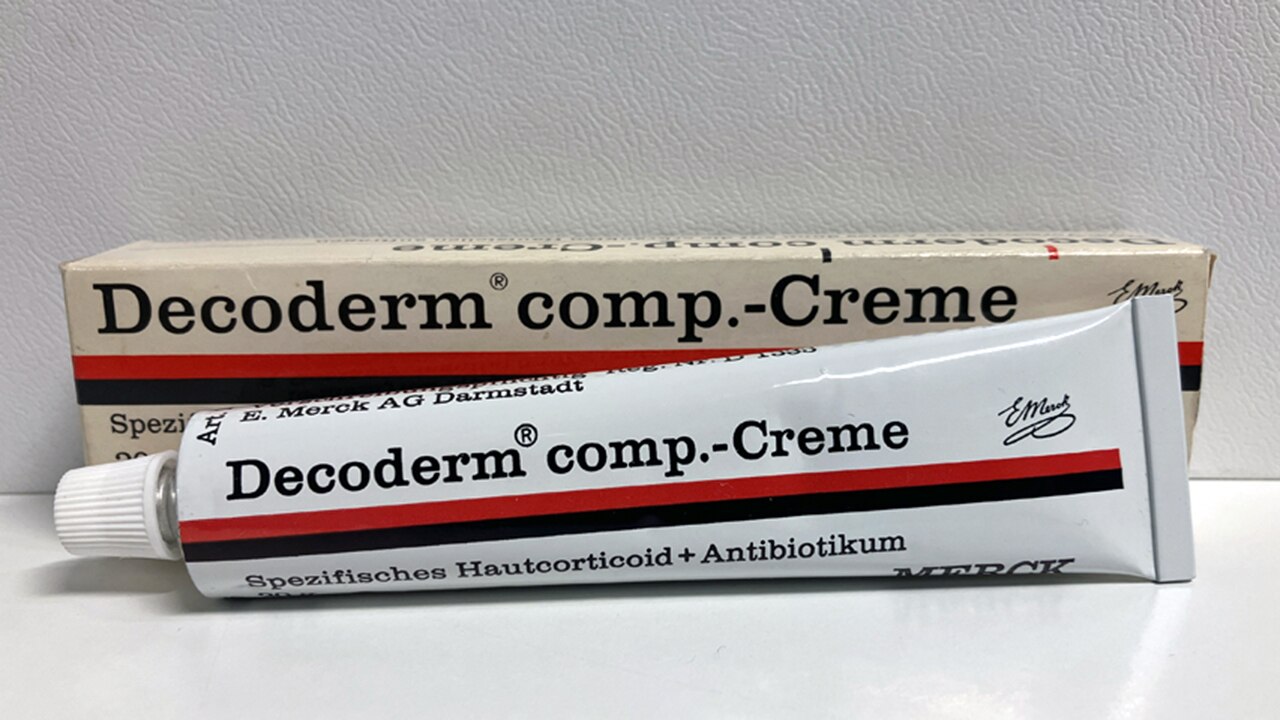
textblock default title
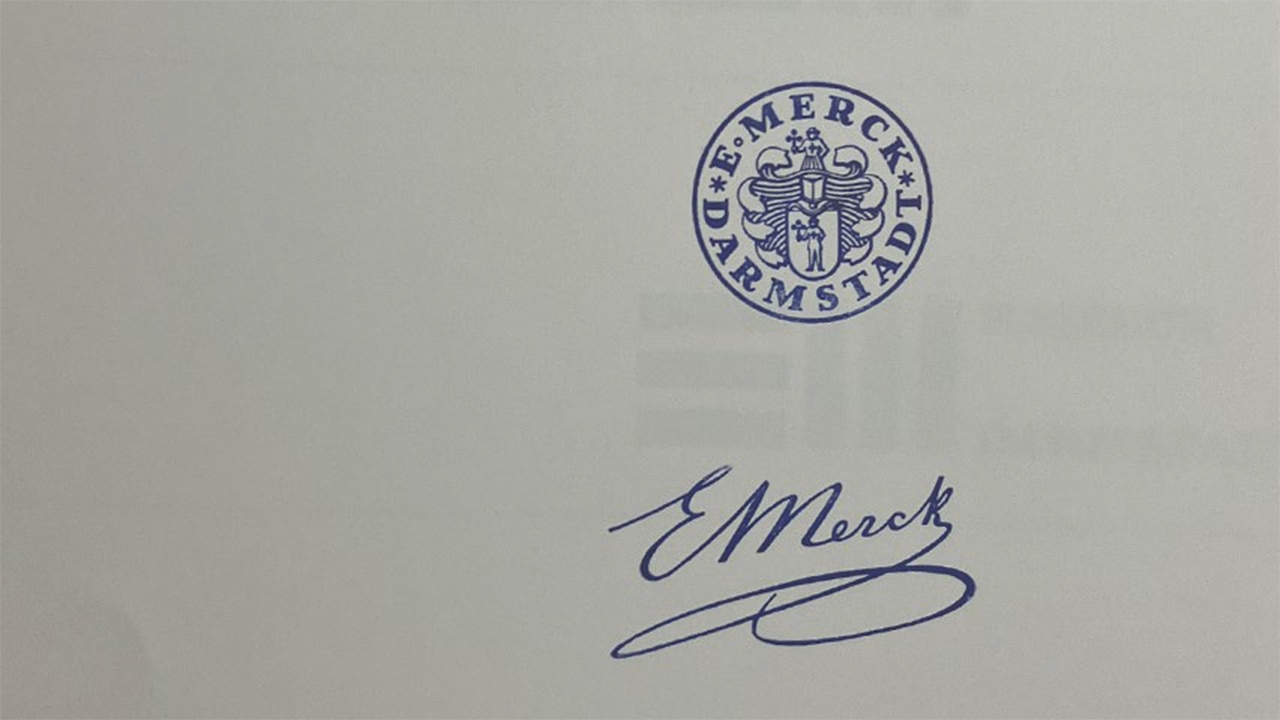
The coat of arms with the Chamomile Man and the stylized signature of Emanuel Merck had been used as a company logo on all packaging since the 1940s. According to a study commissioned in 1968, the target group – in particular physicians, chemists and pharmacists – associated these symbols with “tradition” and “purity”.
No wonder, since the company had represented both for decades prior. Emanuel Merck, a sixth-generation pharmacist, played a crucial role in this. His research area was the preparation of potent natural plant substances, especially alkaloids such as morphine. In 1827, he presented them in a collection known as a “Cabinet of Novelties”. “Tradition” and “purity” are thus widely perceived to be part of the company’s “DNA”. However, something was missing…
textblock default title
The old symbols, 1940s
“Ongoing growth phase, especially outside Germany”: The 1960s were good for Merck. Director Hans Harms suggested designing a new logo that would seize on this positive development and represent the company’s high reputation. The Executive Board was in complete agreement: The Chamomile Man had served his purpose. The objective was to demonstrate “progressiveness”. “[We want] to represent the situation as it really is in just one word.” In addition, the company’s 300-year anniversary was coming up in 1968 – a good time to introduce something new.
textblock default title
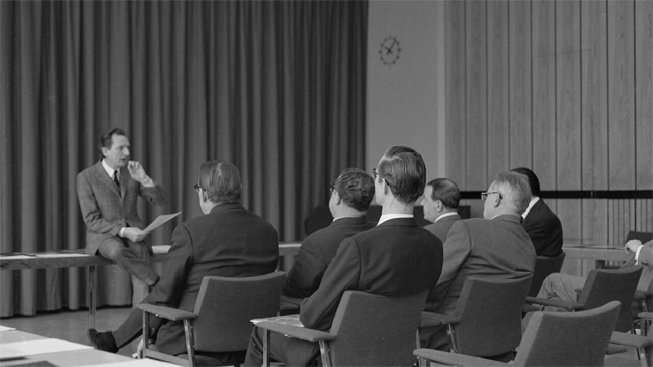
Kurt Weidemann (left) during a presentation to Merck representatives, 1970s
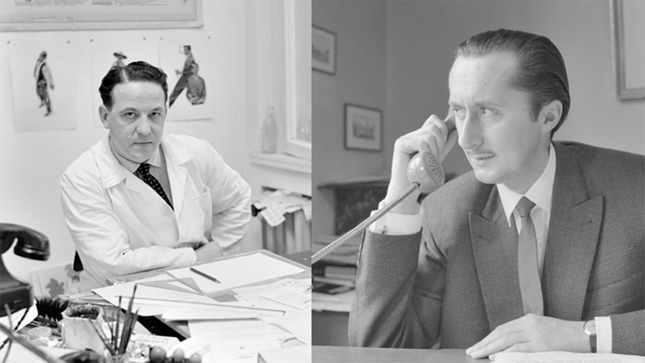
Kurt Weidemann, Professor of Information and Graphic Practice at the Stuttgart State Academy of Art and Design, was hired as a consultant for this task right after giving a presentation on June 21, 1967. Together with Merck employees Fritz Ebner (public relations) and Karl Weidenhammer (graphic studio), an invitation to tender was prepared. Among other things, the logo had to do justice to the reputation and global significance of the company, had to have a memorable, strong visual presence, had to stand out, had to have longevity, and had to be universally and internationally applicable.
textblock default title
Karl Weidenhammer / Fritz Ebner
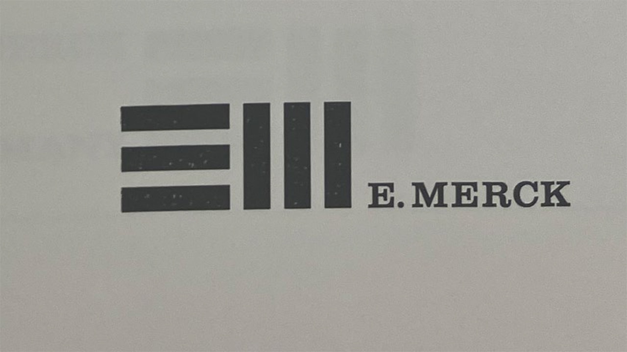
Five agencies and graphic artists were invited. The drafts had to be submitted by December 1, 1967. The jury comprising members of the Executive Board as well as external experts decided on the logo by Wim Crouwel from the Amsterdam-based agency Total Design. But the Patents department said no! The graphic element consisting of six stripes was too unspecific and not protectable. A UK company already had a similar symbol. So the logo was thrown out!
textblock default title
Logo, draft: Total Design, 1998
In addition, it also became clear that simply creating a new company logo would not be enough – a more comprehensive approach was needed. A change of the logo should accompany a change of the entire company image. A “committee for the coordination of public relations and advertising” was founded. As a representative of the Executive Board – and with his particular understanding of aesthetics – Emanuel Wilhelm Merck, together with Fritz Ebner and Kurt Weidemann, organized working groups for printed company materials, advertisements, exhibitions, packaging and labels, and coordination of public relations outside of Germany, as well as interior and exterior
architecture in order to align the company branding “towards the future.”
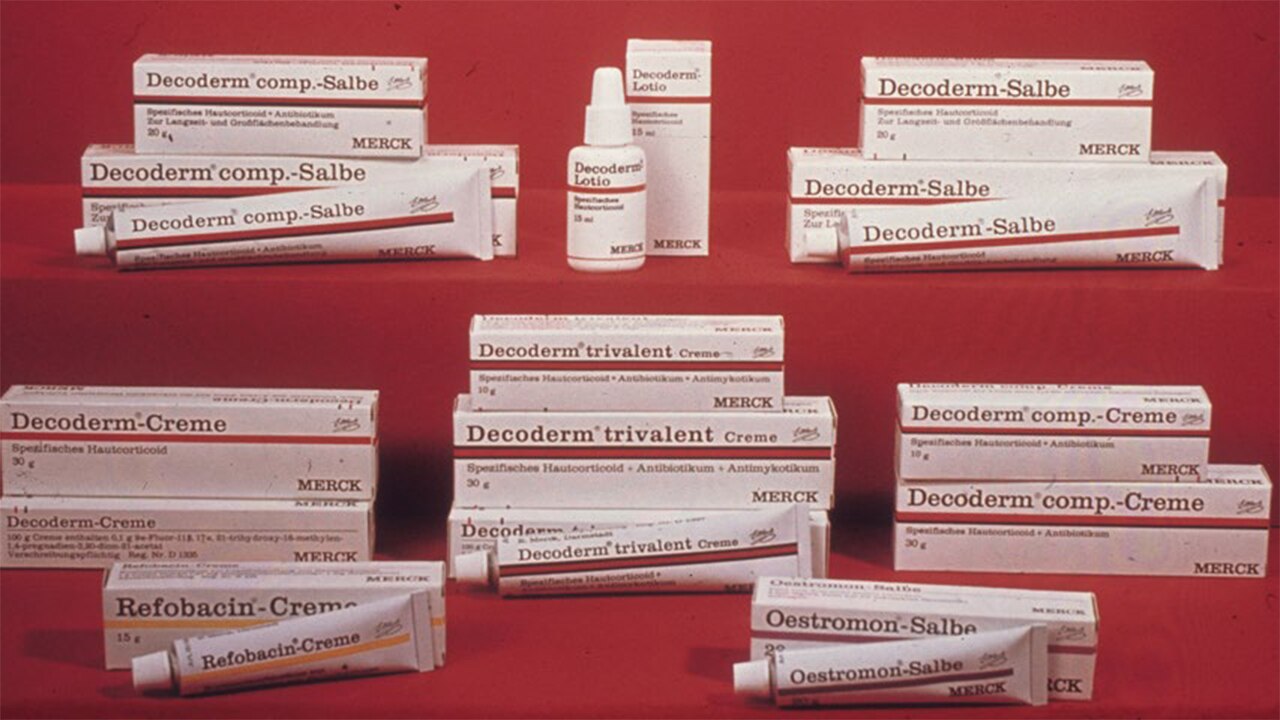
This started with taking stock of the current situation and was followed by the introduction of new design guidelines on February 28, 1969, which Weidemann himself created. The first demonstration object is the packaging for Decoderm ointment.
textblock default title
Decoderm packaging design in accordance with the new design guidelines, 1969
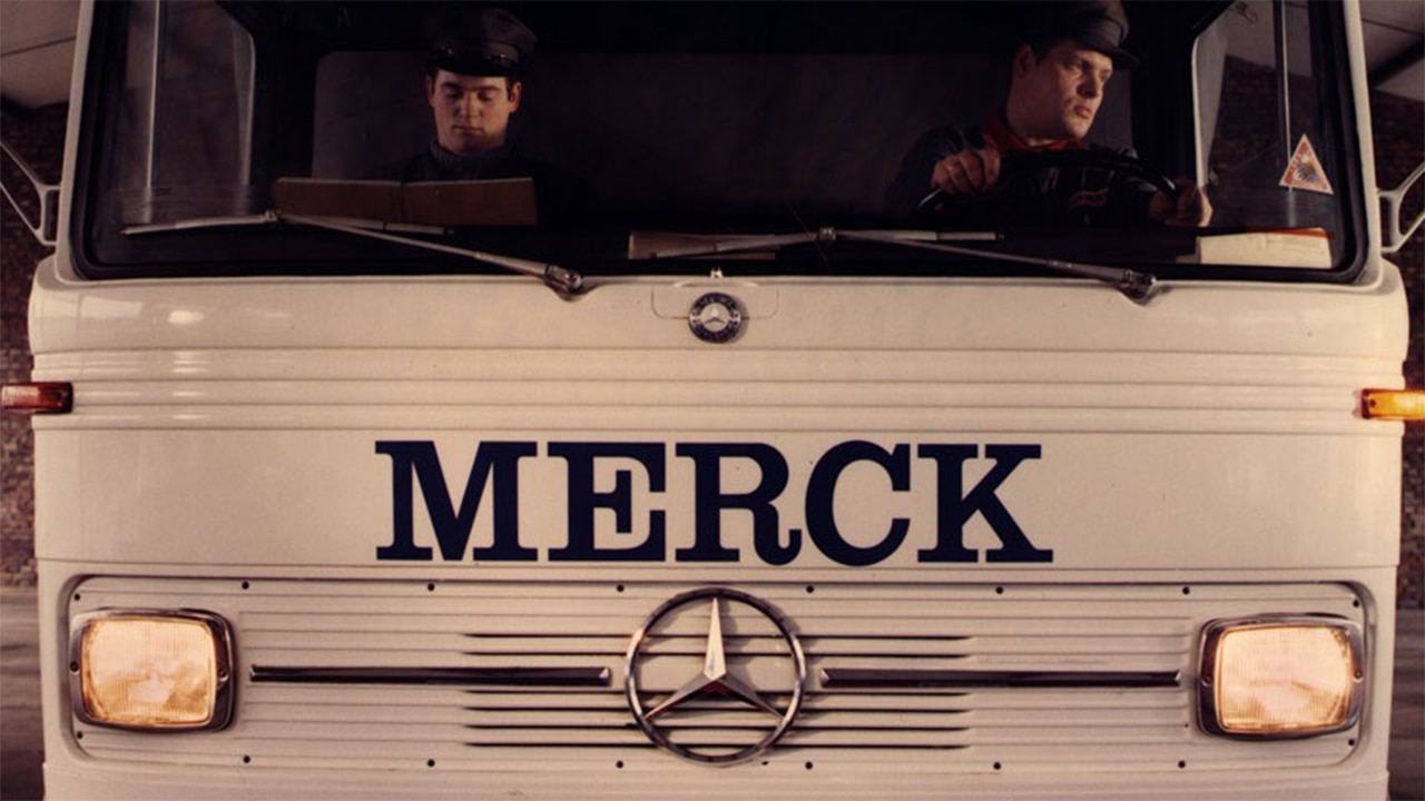
He stated: “The design is a triad of style, efficiency and function. The form and application of the brand, the design of business papers, the advertising prints, the indoor and outdoor advertisements, the vehicle fleet, and the uniform application of text and color give the company its visual presence and make it distinctive. The pharmaceutical packaging is special. It’s not a sales assistant in a self-service shop but rather, primarily, an information medium. Hygiene and shelf life must be taken into consideration as well as legal requirements and market distribution channels.” The requirements of the German Health Services and Products Advertising Act, the need for a suitable presentation for pharmacies and the necessity for clear, distinguishable information for patients meant the focus could not
solely be on fashionable and aesthetic considerations.
textblock default title
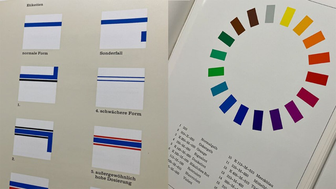
Template for the use of the colored stripe / all 18 colors, design guidelines, 1970
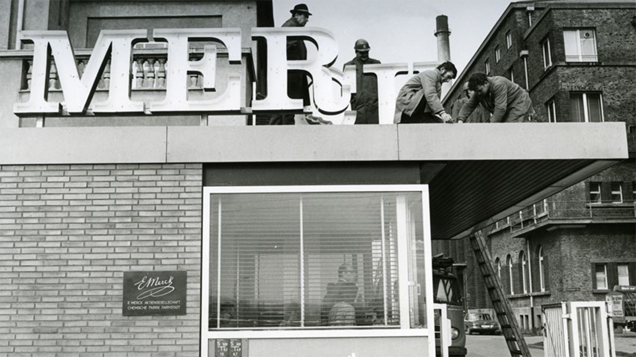
The new packaging had a white background labeled with the serif font “Clarendon” and was decorated all around with a colored stripe. A total of 18 colors were available. In order to make the active ingredient quantity or the pack sizes clear, this colored stripe could be varied by making it wider or adding another stripe. Shapes, colors and sizes were the same for each product so that they could be produced globally. The basic shapes were kept simple enough that they also worked for new products. The “MERCK” lettering was now the new, future-oriented logo.
textblock default title
To make the transition easier for customers, the old lettering remained on the packaging for a short time alongside the new design; “tradition” is a powerful argument. 105,480 letters were sent to business partners in Germany to inform them about the new company
image.
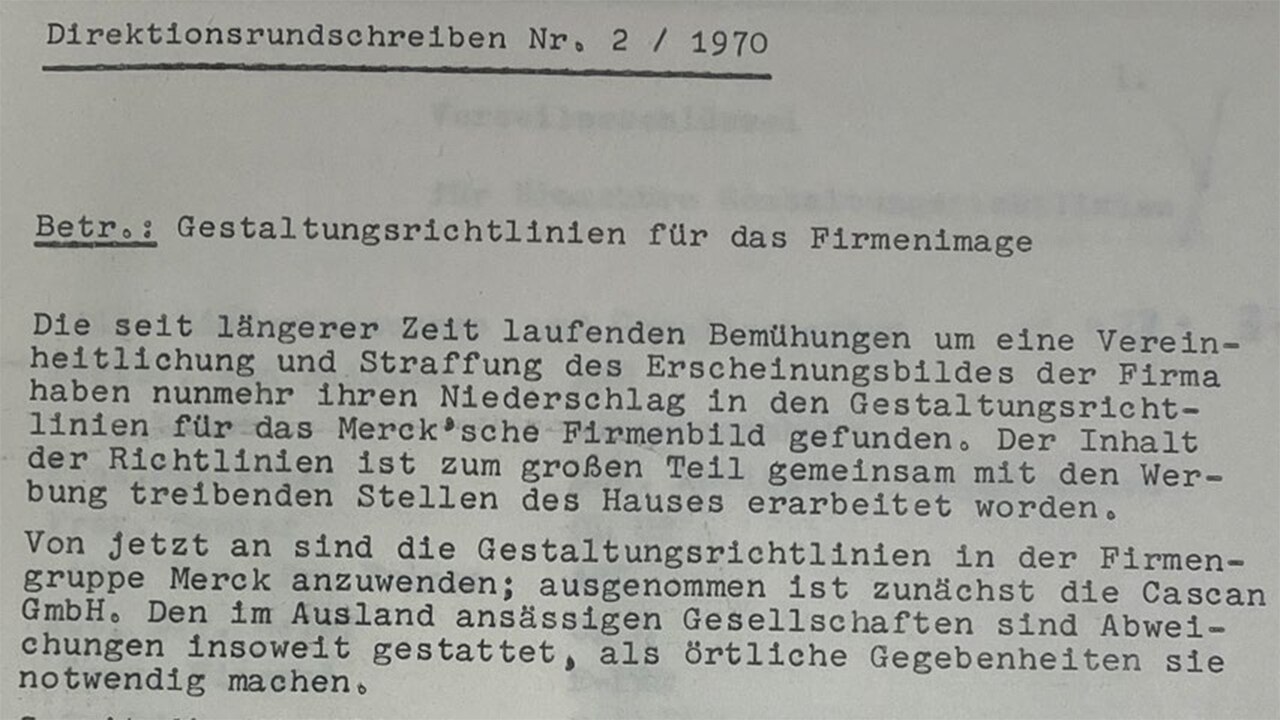
The management circular 2/1970 sent on March 5, 1970, declares the new company image official: “From now on, the design guidelines of the Merck Group are to be used.”
textblock default title
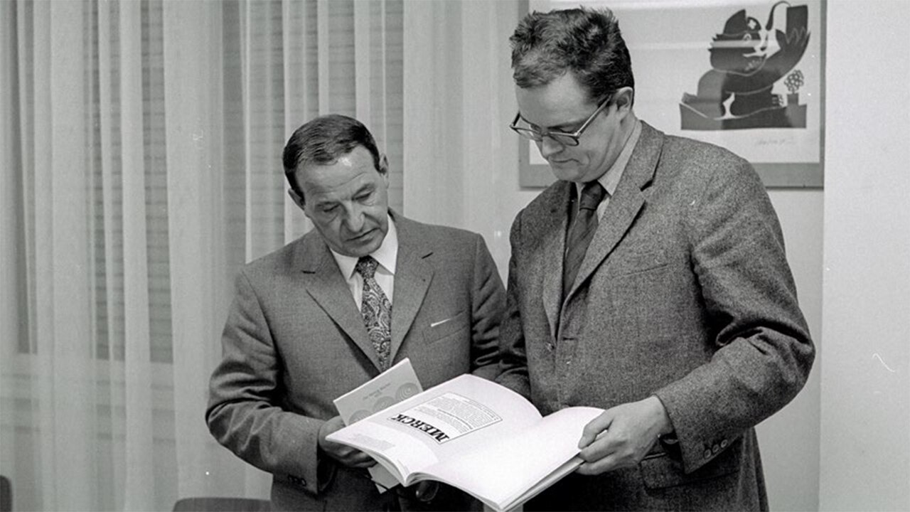
At the award ceremony: left: Peter Willberg (Stiftung Buchkunst), Karl Weidenhammer (Merck graphic studio)
The new design received praise from media outlets including the Darmstädter Echo and Handelsblatt newspapers as well as the Pharmazeutische Zeitung journal. The “Gestaltungsrichtlinien Merck” (Merck design guidelines) – a summary of the graphic features bound as a book – were included in the list of the best printed products by the Stiftung Buchkunst in 1972!